Intro
This vignette demonstrates how to prepare a QTL trace plot in a
reproducible way and publication ready. The steps include loading data,
extracting physical or genetic positions, identifying significant
thresholds, and visualizing results with geneticMapR
functions based on ggplot2 and ggpubr.
Load CIM Results
Let’s load the previous results from the QTL analysis script.
load("../data/plot_trace_pop2.RData")Setup
Using names(M2$pheno)[-8] dynamically selects all phenotype variables except the ID (8th column).
Helper functions
This section defines a few utility functions used throughout the analysis. These functions streamline common tasks, including combining QTL results across multiple traits, extracting physical positions from marker names, and determining significance thresholds from permutation tests:
combine_qtl() merges QTL mapping results for multiple
traits into a single data frame while adding a column to indicate the
trait name associated with each result.
add_physical_pos() parses marker names to extract and
convert physical positions (in base pairs) into megabases (Mb), which
are useful for plotting along chromosomes.
get_thresholds() filters QTL peaks that exceed a LOD
score significance threshold (typically the 5% level) and returns the
relevant chromosome(s), the threshold line, and the associated trait
label for visualization.
These helper functions simplify repetitive tasks.
combine_qtl <- function(results, trait_names) {
  do.call(rbind, lapply(names(results), function(i) {
    df <- results[[i]]
    df$response_var <- trait_names[match(i, names(results))]
    df
  }))
}

add_physical_pos <- function(df) {
  marker.name <- rownames(df)
  split_marker <- strsplit(marker.name, "[_.]")
  df$phys.pos <- as.numeric(sapply(split_marker, `[`, 2)) / 1e6
  df
}

get_thresholds <- function(qtl_df, perm_df, trait) {
  sig_thresh <- perm_df["5%", 1]
  qtl_df %>%
    filter(lod >= sig_thresh) %>%
    distinct(chr) %>%
    mutate(hline = sig_thresh, response_var = trait)
}
Thresholds
In this step, we compute the LOD score significance thresholds for each trait using results from permutation tests. This is important to identify which QTL peaks are statistically significant.
The code uses the get_thresholds() helper function to
extract chromosomes with QTLs exceeding the 5% significance threshold
for each trait. The results are combined into a single data frame,
thresholds_df2, which will later be used to add horizontal reference
lines (significance cutoffs) in QTL plots.
Trait Colors
We are working with multiple traits, which is useful for QTL mapping projects. To ensure consistent and visually distinct plotting across traits, we define a named vector of colors for each trait. These colors will be used in visualizations such as QTL plots to easily distinguish between traits like tip angle, width, length, and biomass. This improves clarity when interpreting multi-trait results and enhances the overall readability of figures.
trait_colors <- c(
  tip_angle_top = "#d55e00",
  width_50 = "#cc79a7",
  length = "#0072b2",
  shoulder_top = "#f7a600",
  length_width_ratio = "#009e73",
  biomass = "black"
)
Combine and Annotate QTL Results
In this step, we merge QTL mapping results across all traits into a single data frame. For each trait, we extract the corresponding QTL output, annotate it with the trait name (response_var), and bind the results together.
We then add to the combined data the physical positions (in
megabases) using the add_physical_pos() helper function.
These physical positions are parsed from the marker names and are
essential for visualizing QTLs along chromosomes with accurate genomic
context.
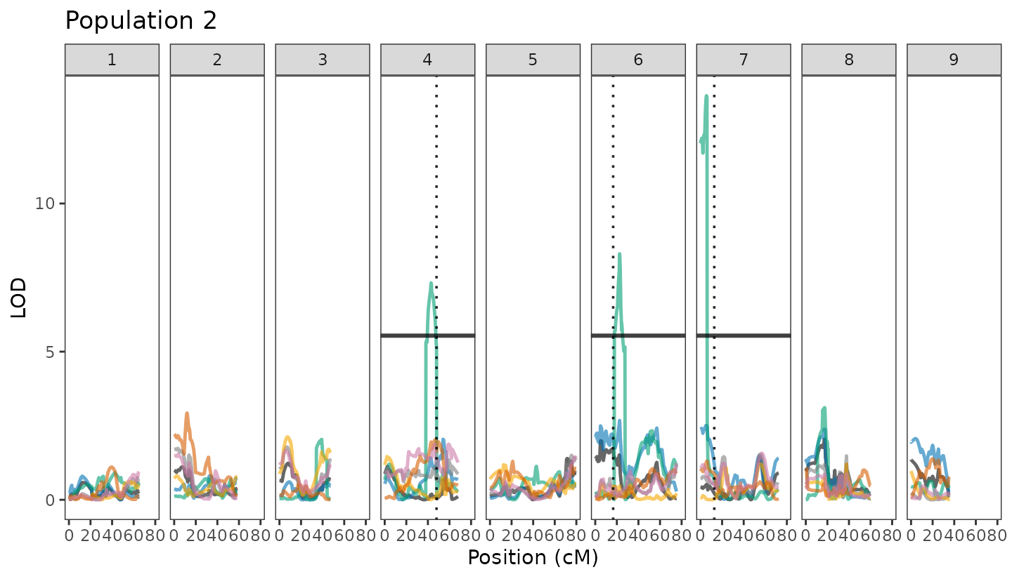
Known QTLs (Vertical Lines)
To help interpret the QTL results in the context of prior knowledge,
we define a set of known QTL positions for specific chromosomes. These
are stored in the vline_df2 data frame, where each row
corresponds to a chromosome and the vline column indicates
the physical position (in megabases) of a known or previously reported
QTL.
These values can later be used to add vertical reference lines to plots, highlighting regions of interest based on previous knowledge or literature or your own previous projects!. Chromosomes without known QTLs are assigned NA.
vline_df2 <- data.frame(chr = unique(pop2$chr),
                        vline = c(NA, NA, NA, 48, NA, 16.6, 12.75, NA, NA))
Draw QTL trace using better visualization
Draw QTL Trace Using Better Visualization This plot visualizes the QTL scan results for Population 2 across all chromosomes. Each trait is shown in a distinct color (as defined earlier), with the LOD score plotted along the y-axis and the genetic position (in centimorgans) on the x-axis.
Key visual elements include:
LOD curves (geom_line) for each trait showing QTL signal strength.
Horizontal lines (geom_hline) marking the trait-specific significance thresholds based on permutation tests.
Vertical dotted lines (geom_vline) indicating positions of known QTLs, aiding comparison with previous studies or expectations.
Chromosomes are displayed side by side using facet_wrap, allowing for clear comparison of QTL distributions across the genome. The result is a clean, interpretable plot summarizing multi-trait QTL signals for Population 2.
pop2_plot <- ggplot(pop2, aes(x = pos, y = lod, color = response_var)) +
  geom_line(linewidth = 0.85, alpha = 0.6) +
  geom_hline(data = thresholds_df2, aes(yintercept = hline, group = response_var),
             size = 1.05, alpha = 0.75) +
  geom_vline(data = vline_df2, aes(xintercept = vline),
             linetype = "dotted", color = "black", alpha = 0.85, size = 0.63) +
  facet_wrap(~chr, nrow = 1) +
  theme_test() +
  theme(legend.position = "none") +
  scale_color_manual(values = trait_colors) +
  labs(x = "Position (cM)", y = "LOD", color = "Trait") +
  scale_x_continuous(limits = c(0, 80)) +
  ggtitle("Population 2")

pop2_plot